Friday, March 31, 2017

More & More

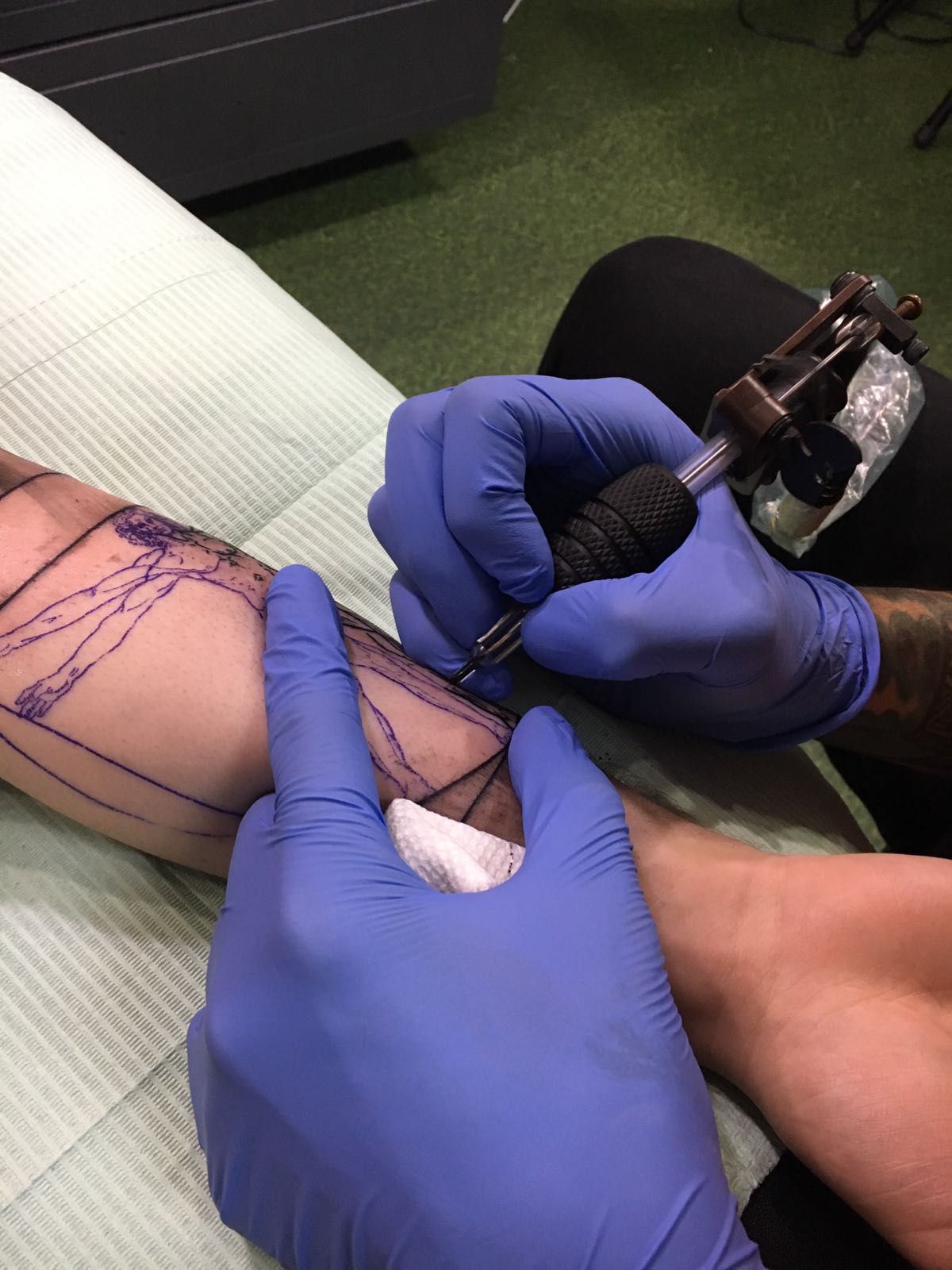
Guys, I accompanied my friend to a tattoo shop today, which means.. MORE PICTURES FOR MY MAGAZINE!! He had mentioned he was going today to get a tattoo and so I was like, "Nicole this is your chance for more pictures!"

Sooo.. I took these:
    These two are my friend's tattoo.

This one shows the process.


These two pictures are of the tattoo artists and the one on the right is the one who created my friend's tattoo and his name was Pablo... I tried to see if there was any other information about them on their website but there seems to be none.


Sources:
"Double Cross Tattoo – (954) 581-6629 – Fort Lauderdale & Miami |." Double Cross Tattoo – (954) 581-6629 – Fort Lauderdale & Miami |. N.p., n.d. Web. 31 Mar. 2017.


Thursday, March 30, 2017

Inkspiration!

While shuffling through Ms. Marchetti's magazines, I found some amazing ideas for my table of contents... Thanks Marchetti!!

So okay, I wanted my table of contents to be as different not only from tattoo magazines table of contents but also just regular magazines. So while I shuffled I found this amazing work of art:

This picture was on the "Art News" magazine.


This gave me the great idea to use for my table of contents since I could do various sleeve tattoos and put them all together in the way the picture on the left is. It will be very abstract but very eye catching at the same time.

I asked my classmates on their thoughts on this table of contents but they said it wouldn't look the way I wanted... Let's hope they aren't right.


Source:
"Table of Contents." Art News n.d.: n. pag. Web. 30 Mar. 2017.


Wednesday, March 29, 2017

Progresss


Excited to say I have finally started taking some pictures for my magazine. I had to go to Miami Beach yesterday to run an errand I did not want to do, but it ended up being a successful day! As I walked through the streets of Miami Beach I ran into two tattoo shops one I didn't really take pictures of since the inside of it wasn't really what I was looking for... But the other one was a success! Love Hate Tattoos is a tattoo shop based on a TV show called Miami Ink. I have never watched the show but I do know they are known for it. I took various pictures of a guy getting a sleeve tattoo but I'm not sure if I will end up using one of them for my cover, the ones I liked the most are to the left of this blog post.


The amount of color in this picture makes it hard for me to go through with the color splash idea.... Orrr maybe I could make the idea even better by using the color splash on all the vibrant and beautiful colors. I am still deciding on what to do.


Sources:
"Love Hate Tattoo Studio." LOVE HATE SOCIAL CLUB. N.p., n.d. Web. 29 May 2017.


Sunday, March 26, 2017

Color Schematics

Now on with the color schematics...

Surprisingly this post isn't going to be as long or as time consuming as the other ones since I already have an idea of what colors I will be using. On one of my earlier posts I had said I was breaking away from the norm by not using a semi nude or sensual woman as my cover but I am not completely breaking away from the norm. My cover will indeed be black and white with a splash of vibrant colors but the rest will be as colorful as all the other tattoo magazines. On this website where it talks about color psychology, I know now that red is going to be the color I most use... Maybe I'll use red for all the text or the outlines of the pictures and some purple to emphasize and convey "imagination and creativeness."

This is the color chart showing each
emotion conveys which color.

This picture conveys each brand's personality depending on the color used.


Sources:
Ciotti, Gregory. "The Psychology of Color in Marketing and Branding." Help Scout Blog. N.p., 17 May 2016. Web. 25 Mar. 2017.

Slowly But Surely Getting There

The Font~
After figuring out my cover and the layout of it I now move on to the more specific stuff, like... FONT! Different fonts are used for different types of magazines depending on the magazine content and what idea or message they are trying to convey to their audience. As I surfed the web for tattoo magazine font ideas, I came across this website where you can search up fonts for anything you want. There are over 138 fonts I could use for my magazine, so I guess I need to start checking each one to see what would fit my magazine better. I also used Pinterest, the amazing application Ms. Marchetti shared with us, and I found interesting fonts once I searched up "tattoo magazine font" like these:
These fonts try to convey the idea of letters as tattoo letters
in an abstract sort of way.


To be honest, I kind of dig the idea of my font being abstract and giving it my magazine a different kind of look. 

Another  incredible awesome website that I found while surfing the web was one that talks about the psychology of fonts. It's quite informative and now I know that I will have to use an artistic font because they are for "custom creations", like tattoos. The artistic fonts create some sort of visual design for my theme, in this case tattoo, so I want to incorporate that into my magazine. 

Sources:
"132+ Results for Tattoo Magazine." Tattoo Magazine () - Abstract Fonts. N.p., n.d. Web. 24 Mar. 2017.
"Font Psychology: What Your Font Says About Your Website." MonsterPost. N.p., 08 Nov. 2016. Web. 24 Mar. 2017.

Thursday, March 23, 2017

Co(lor)ver

We are now three weeks into our project and I still haven't created a draft or a layout for my cover. After putting a lot of thought into it I might not even end up using a woman for my cover, which means I am breaking away from the norm even more. While I surfed the web for ideas and inspirations I came across this website where a this picture caught my attention:


I don't know why I was so mesmerized by the color contrast between the black and white background and the extremely colorful and vibrant scarf on the dog. This ignited an idea in my head about changing my cover. I am now thinking my cover is going to be all black and white with a very vibrant and colorful arm with a sleeve tattoo, or in a more technical term, a 'color splash'. That would be a cover that catches people's attention and plus I think my target audience(men and women ranging from ages 16-25) would be as intrigued as I am.


I kind of have a picture in my head of what I want my cover to look like, with the man standing where the shop is visible and the whole background and picture to be black and white except for his sleeve tattoo. I made a layout so it's easier to picture my idea.
Thanks to Snapchat's great features
I was able to portray my idea on
paper, or should I say on screen.
I'm going to have to head over to a tattoo shop in order to shoot pictures of people with sleeve tattoos since I don't really know anyone who has a sleeve tattoo. I am planning on going this weekend but I will be looking for a specific man to pose for me.

Sources:
Beta, Brodie. "10 Photo Effect Apps to Make Your Android or IPhone Shots Spectacular." The Next Web. N.p., 17 Mar. 2016. Web. 23 Mar. 2017.

Friday, March 17, 2017

Getting More Into My Idea

Well I was thinking about my tattoo idea and since I changed my Url to tattoo obsession I think I should change my blog name as well... I had thought of naming it "Inked" but as I did research for the creation of the magazine I realized it was taken and its quite popular. The magazine's website is so artistic and it is actually everything I want mine to be. They even have a section of "cool tattoos" that looks like this.


 It has stories and lots of really amazing pictures... Anyways, I then thought of "Needles" and I have searched it up and it is surprisingly not taken!

I guess Needles is going to be my name then! Super excited for upcoming things....


Sources:
"Inked Magazine." Inked Magazine. N.p., n.d. Web. 17 Mar. 2017.